

One of the most important things when developing a website is ensuring that it is easy to navigate. Having a good user experience is a fundamental element of each website and menu design plays an important role.
A good practice for website menu design is to keep it simple and intuitive. The menu should be easily accessible anywhere on the website, typically by placing it at the top of the page and creating a sticky option. The labels for the menu items should be clear and descriptive, and the structure of the menu should be organized logically. Additionally, it’s a good practice to consider the mobile user experience, ensuring that the menu is easy to navigate and use on small screens.
Website Navigation and UX
A menu, in website terms, is a series of linked items that navigate you throughout a website. You will see a website menu on the majority of the websites you visit. When creating a website menu you have to take into consideration the amount of information that a user needs to access the site. UX plays a great role in designing the structure of the navigation. You are striving to build easy access paths that guide users through your content. Consider a menu a roadmap or a table of contents that summarizes your site in a set of links.
1. Mega Menus
A mega menu is a drop-down menu that is in a large, rectangular format. Mega menus are used by websites that have a lot of content and eCommerce sites with multiple product options. When dealing with larger websites that contain a lot of information and different pages, it’s good to use a larger menu that makes it easier for the user to find what they are looking for. Large content websites can be confusing for the user and finding their specific piece of content can be hard because of the abundance of information provided. An organized mega menu can prevent the user from searching for any particular content. The blow sample is a great representation of a well-design mega menu. View this menu live here.

2. Simple Top Navigation Menus
A simple top navigation menu is a horizontal menu that is positioned across the top of the webpage. It typically contains standard drop-downs and a callout for contact. It is better used for websites with content that falls under a limited amount of well-organized pages. It is a good menu for any small website because of its simplicity and clarity. This menu can be easily turned into a sticky menu. This menu anchors to the top of the page and “follows” the scroll as the user interacts with the page. View a sample of the well-design top navigation.

3. Hamburger Menu
The hamburger menu is probably one of the most controversial ones. Often used on higher-end websites where the aesthetic is really important and the content across the top could distract a visitor from the overall message. The icon for the burger menu has widely come to simply mean “the menu”. Some of the most popular websites, like Google, use this icon frequently. When the icon is clicked, it usually opens up a sidebar or a full-page menu. The navigation menus are more common on mobile applications since the display real estate is very limited on a phone screen. Here is an example of a well-executed hamburger menu on a desktop. View the live menu application here.

4. Full Page Menus
Full-page menus are often visually stunning and allow for greater use of space. You can incorporate animation, images, and other graphics into a full-page menu. They are often triggered by a hamburger menu to create a high-quality navigation system for the user. It’s a very well-organized website menu design that allows for simplicity and a lot larger callouts than a standard menu design. It also grants you more creative freedom when it comes to your menu. See a full-page menu in action.

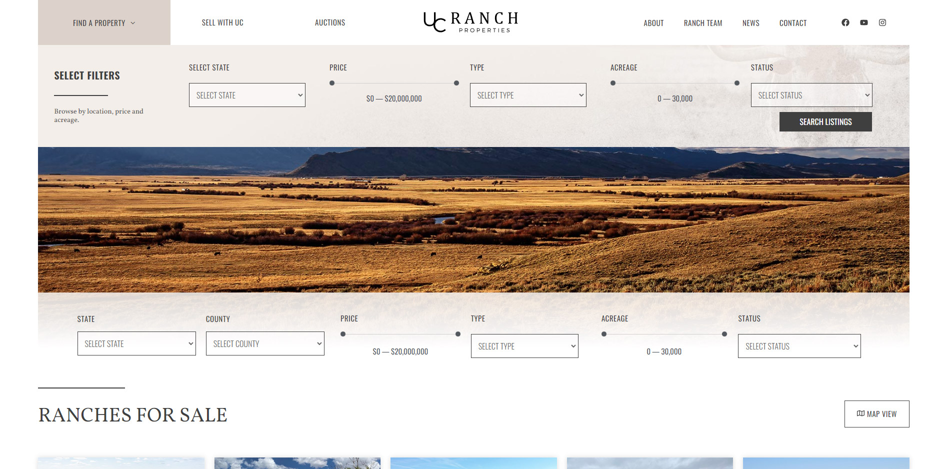
4. Functional Menu
The technology is fast improving and now web developers can include a lot more functionality into the main navigation, further improving the User Experience. Filters, product searches, and selectors can all be now incorporated into the main navigation, either directly or in a form of a mega-menu drop-down. Here is an example of a well-executed menu with a real estate search and filter functionality embedded directly into the navigation. View the live sample here.
If you are looking for a well-designed website that utilizes the latest in technology, contact Lion Tree Raleigh. We are experts in cutting-edge website design with experience in creating websites for small organizations to large businesses. With 3 locations in Madison, WI, Austin, TX, and Raleigh, NC we serve clients across the nation.


